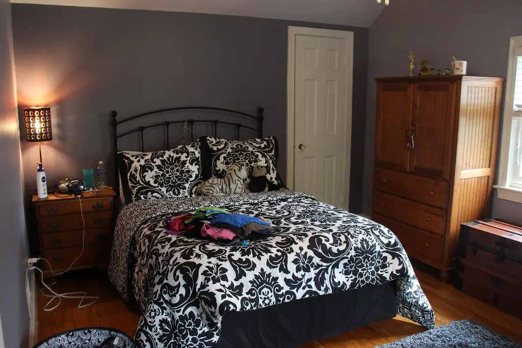
Your bedroom is the one room in the house where you should put the most effort into creating the ideal atmosphere. After a long and hectic day, it is your haven, a place where you may rest and unwind.
Your choice of bedroom paint colors will immediately impact the atmosphere of the space and will determine the remaining accents you use, ranging from your rug to your bedding and all points in between.
While some colors will create a bright and airy vibe, others will make your bedroom feel warm and inviting. Choose a new paint color with these lovely suggestions that will motivate you to make your bedroom the retreat it deserves to be.
Soft Green
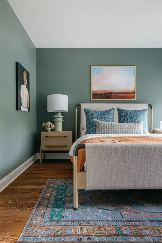
Transform your bedroom with the serene and adaptable hue of soft green, such as Farrow and Ball’s Green Smoke. This shade evolves beautifully throughout the day, offering a perfect balance of coziness and tranquility. “It’s an ideal choice for creating a calm and inviting atmosphere,” says Kelsey Haywood, owner and principal designer of Haywoodmade Interiors.
Calming Light Blue
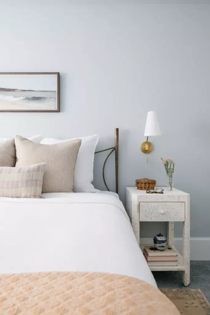
Enhance your bedroom’s ambiance with a light blue shade that exudes calmness. Ideal for both primary bedrooms and guest rooms, this color fosters relaxation and better sleep. “We paired this soothing blue with beach-inspired accents to craft a restful guest retreat,” shares Haywood.
Deep Green
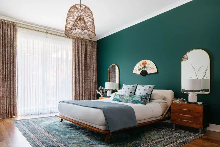
Opt for a bold statement with a deep green shade. If full-room saturation feels too intense, consider using it on a feature wall. “This accent wall complemented the existing furniture perfectly,” explains Haywood. “Rich, saturated tones like these promote both relaxation and rejuvenation.”
Blush Pink
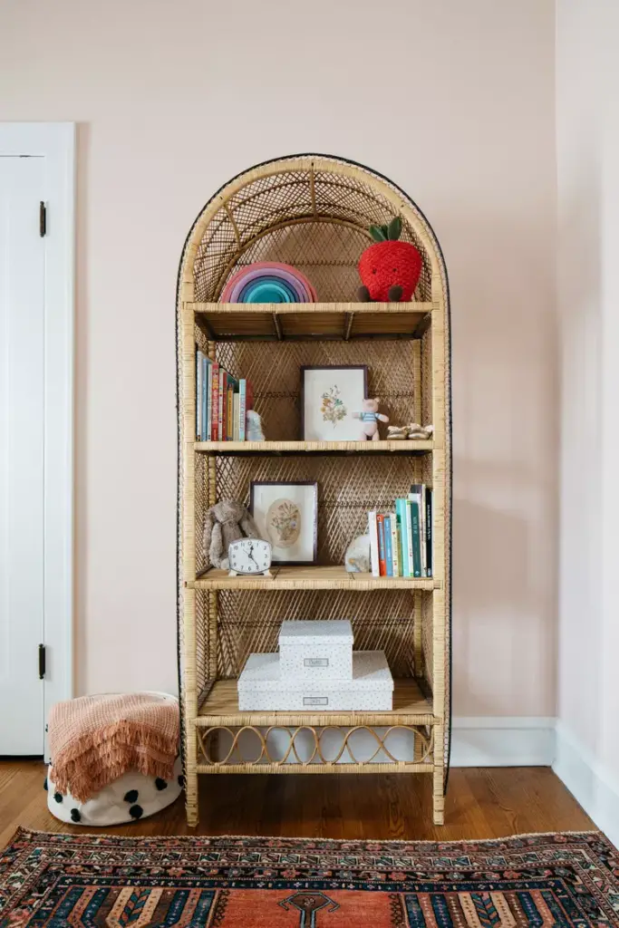
Blush pink, such as Farrow and Ball’s Pink Ground, adds a delightful mix of sweetness and sophistication. “This color transitions beautifully over time, making it suitable for children’s rooms that grow with them,” notes Haywood.
Deep Blue-Gray
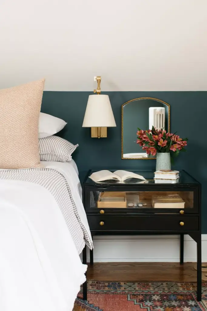
For a dramatic touch, try a deep blue-gray like Farrow and Ball’s Inchyra Blue. Its unique ability to shift between rich and shadowy tones creates depth and interest. “In various lights, it transforms beautifully from dark to vibrant,” Haywood observes.
Neutral Blue
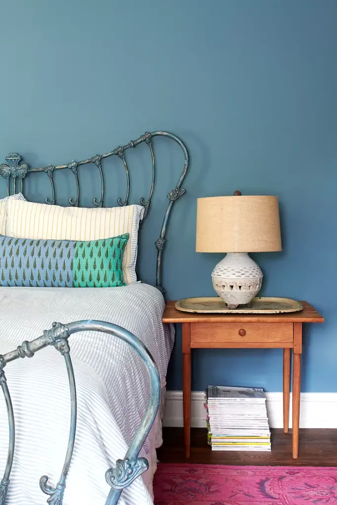
A neutral blue, such as Benjamin Moore’s Newbury Port Blue, offers a calming and versatile backdrop. “This guest room was designed to feel both relaxing and welcoming,” says Michelle Gage, owner and principal designer of Michelle Gage Interior Design.
Classic White
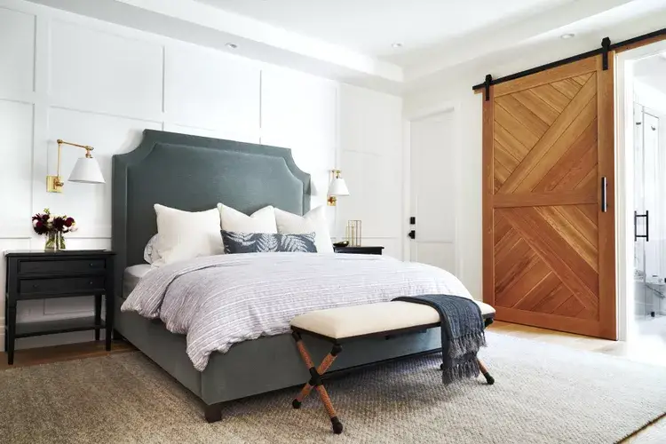
Classic white shades like Benjamin Moore’s Chantilly Lace are timeless choices that amplify light and create an airy feel. “The paneled accent wall in this bedroom is perfectly highlighted by this crisp and clean color,” remarks Amy Peltier, principal designer of Peltier Interiors.
Icy Blue
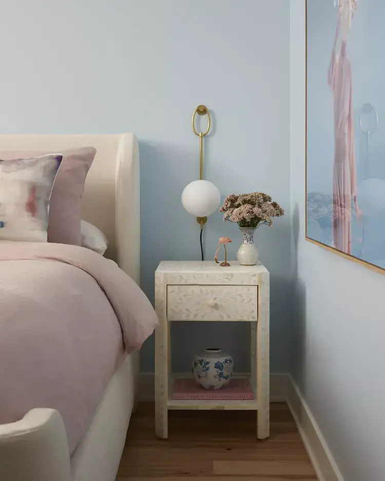
Embrace a fresh and serene vibe with icy blue tones like Benjamin Moore’s Polar Sky. “Our goal was to create a dreamy and sophisticated atmosphere, akin to sleeping on clouds,” says Gage.
Creamy Off-White
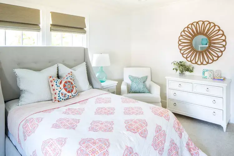
For a soft and versatile neutral, Benjamin Moore’s White Dove is a popular choice. “This color’s gentle warmth allows for colorful accents while maintaining a bright and inviting space,” Peltier explains.
Hunter Green
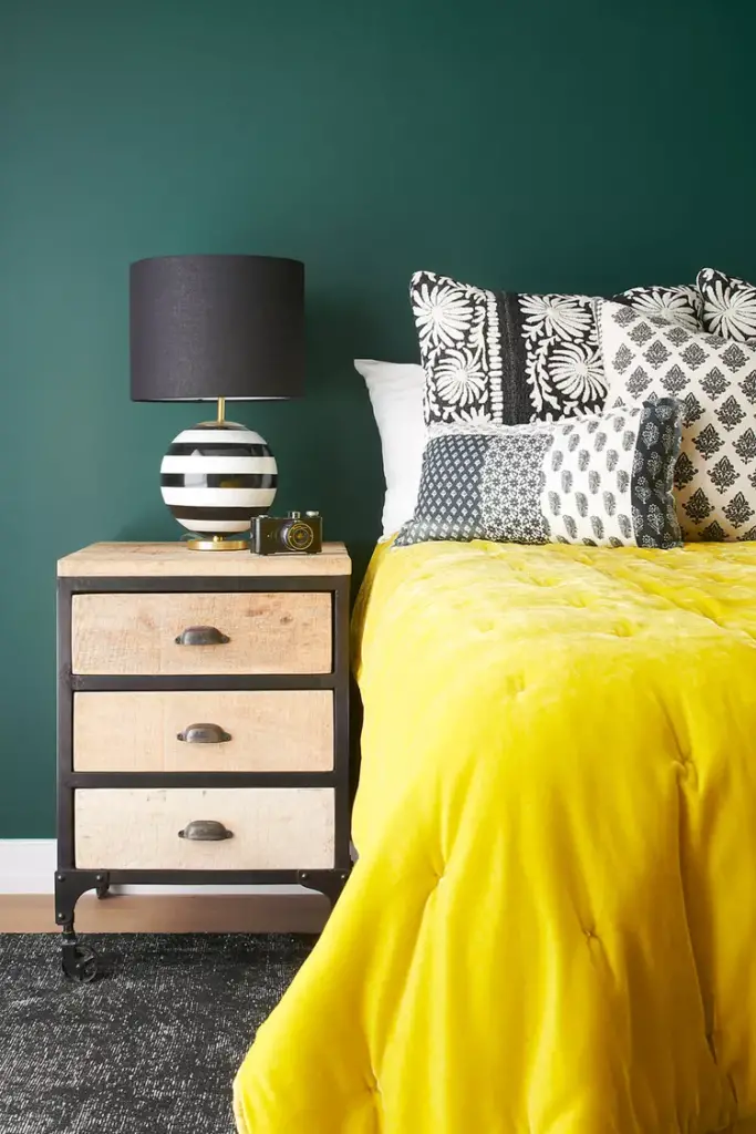
Hunter Green by Benjamin Moore offers a bold and rich backdrop, ideal for rooms with striking decor. “This guest room’s green walls were chosen to complement a vibrant chartreuse comforter, creating a stunning contrast,” shares Gage.
Bright Blue
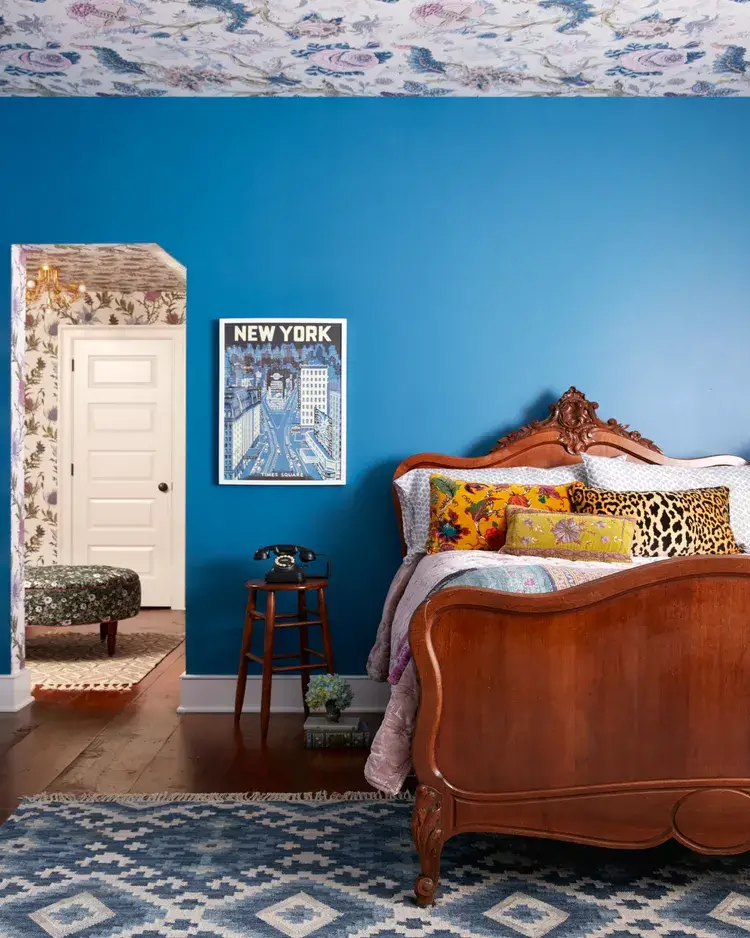
For a playful and vibrant touch, consider bright blue shades like Benjamin Moore’s Santa Monica Blue. “This choice worked wonderfully in a teen girl’s room, adding energy without overwhelming the space,” says Gage.
Iconic Gray
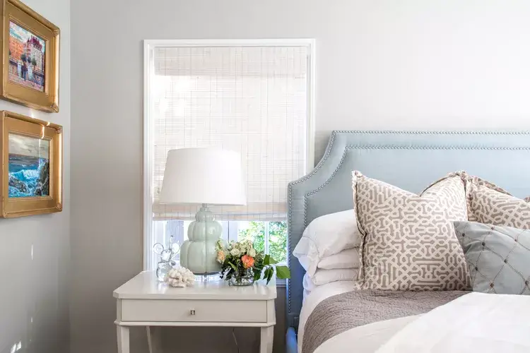
Benjamin Moore’s Revere Pewter is a versatile gray that bridges warm and cool tones. “This neutral base harmonizes beautifully with accents like soft blues and greens,” Peltier highlights.
Dusty Blue
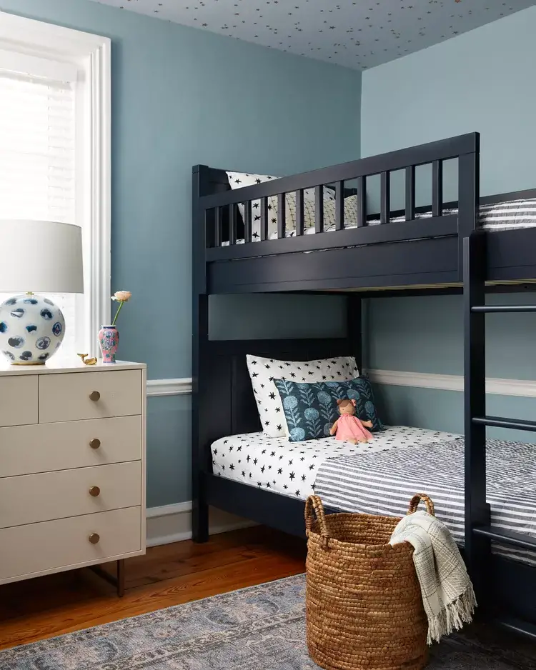
Dusty blue tones, such as Benjamin Moore’s Colorado Grey, are perfect for creating balanced and cohesive designs. “This shade grounded the space without competing with the gold starry ceiling,” explains Gage.
Subtle Blue-Gray
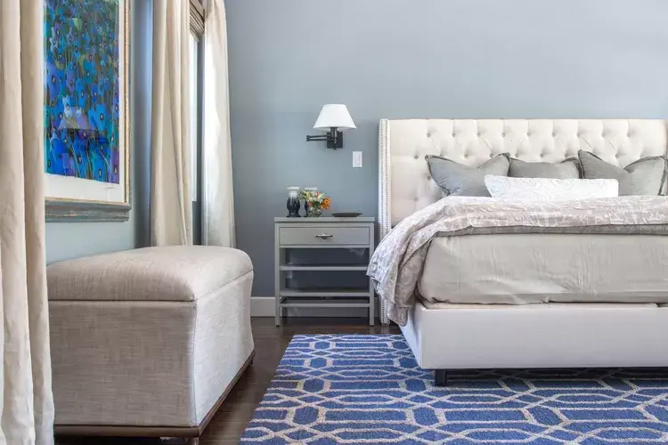
For a gentle touch of color, a subtle blue-gray like Benjamin Moore’s Little Falls is a great option. “Pair it with bold accents to bring out the paint’s understated charm,” Peltier advises.
Dark Navy Blue
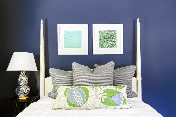
Dark navy, such as Sherwin-Williams’s Sea Serpent, brings a bold and sophisticated feel to any bedroom. “This rich color is balanced beautifully by lighter furniture and accessories,” Peltier points out.
Cool Gray
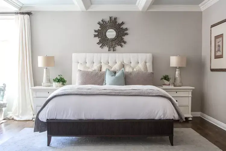
Cool grays with blue undertones, like Benjamin Moore’s Wickham Gray, offer a serene and modern aesthetic. “This color’s neutrality allows it to work seamlessly with various textures and tones,” says Peltier.
Rainforest Green
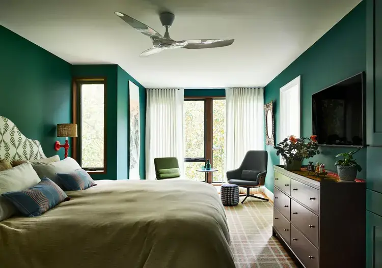
Bring nature indoors with rainforest-inspired greens like Benjamin Moore’s Dragonfly. “This shade evokes a treehouse-like vibe while adding a sense of luxury and comfort,” says Nicole Lanteri, principal designer of Nicole Lanteri Design.
Calming Gray
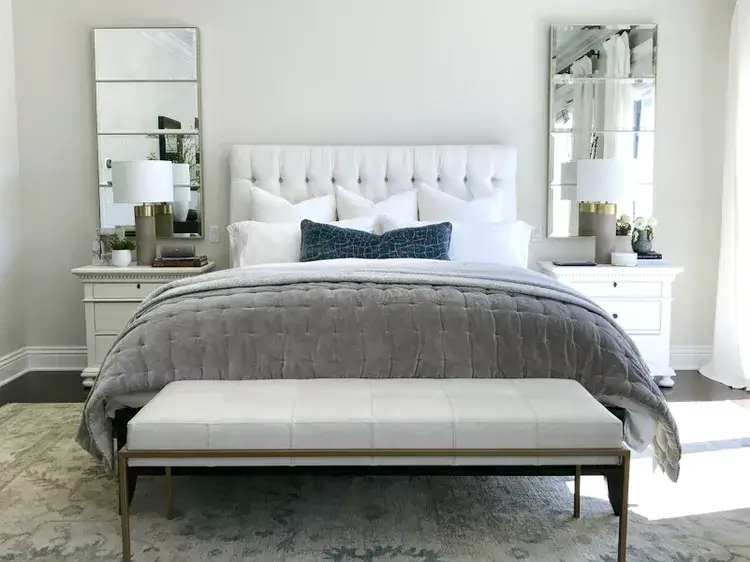
Benjamin Moore’s Calm is aptly named for its soothing and versatile qualities. “This soft gray serves as a neutral base, enhanced by metallic accents and layered textures,” Peltier explains.

